Scoring Table
| Reproduction | Original | Comment |
|---|---|---|
 | 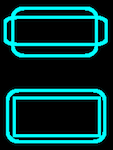 The cyan border should be two rounded rectangle that overlap; one being taller than the score area but the right width, the other being the right height but wider. Currently it looks like a rounded rectangle that is taller and wider encircling a square corner rectangle which is the right height and width. | |
 |  | Cross should be Cyan of border |
 |  | Use “em” Dash not two “en” Dashes |
 |  | Missing Punctuation (periods) |
 |  | Missing Punctuation (period) |
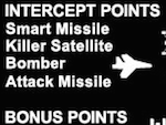 | 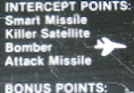 | Missing Punctuation (Colons) |
 |  | The sprites in the game are two colors, that is why the scoring card expresses the two colors with White and Black outlined in White. It looks like the Killer Satellite might be attempting that but the Attack Missile is not even trying. The city also need the two color treatment. |
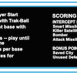 | 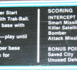 | Separator Missing |
Start
| Reproduction | Comment |
|---|---|
 |  Try using just 3 rectangles instead of forcing all those objects to align |
| START not SART on both Players |
Marquee
| Reproduction | Comment |
|---|---|
 |  Try using just 3 rectangles instead of forcing all those objects to align |


